Week 1
- Members chose roles
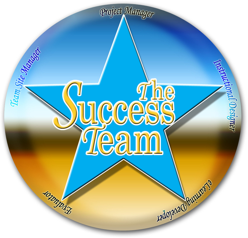
- A name was chosen for the team (The Success Team)
- Google Community was established for the team
- A logo was designed for the team
- Team website was constructed
- Members submitted bios for Team Website
- Individual websites constructed
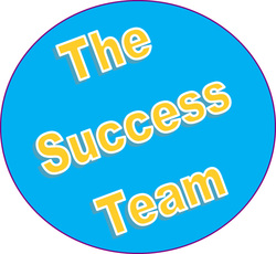
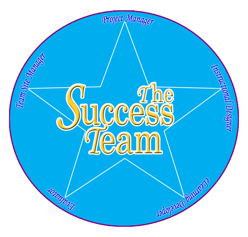
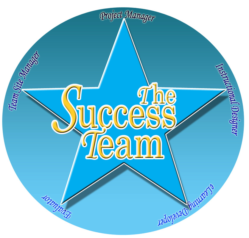
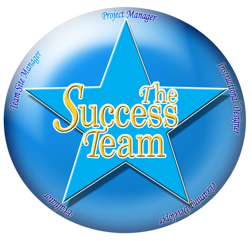
As a 4th grade school teacher, each year I dub my class The Success Team, as I believe that people tend to live up to the labels that are placed on them. After I recommended this name for our team, Steve, our Lead Elearning Developer, researched the color of success, and determined it to be gold. He found that light blue represented peace and tranquility. After making these determinations, he presented us with a logo, which is shown on the left. Afterwards, I took Steve's original logo and revised it some. My revisions are shown below. Together our team decided to go with the far right logo below.
|
|
|
|
Week 2
- Team met to discuss upcoming meeting with SME (Dr. Brescia)
- Perused a number of sources, including yoga books and other Tai Chi books, to get ideas
- Revised the team logo (Originally designed by Lead Elearning Developer)
- Started to design some layouts and templates that may lend itself to what our team was trying to accomplish
Week 3
- Revised the cover designed by the Lead Elearning Developer (Steve Herriman)
- Team
- Assisted team with Item Analysis Report
